

Data Quality Estimation
Data Analysis and Visualisation
Perseus

As a first step the data quality of each chromatographic run can be inspected by visualising the quantity distribution of the identified proteins. Usually this distribution is bell-shaped, few proteins have a low expression level, few proteins have a very high expression level and the majority is found in the middle.
Choose the command: Visualisation > Histogram
In the tabular region of the programme a new tab appears, called Histogram. Click onto the Histogram tab.
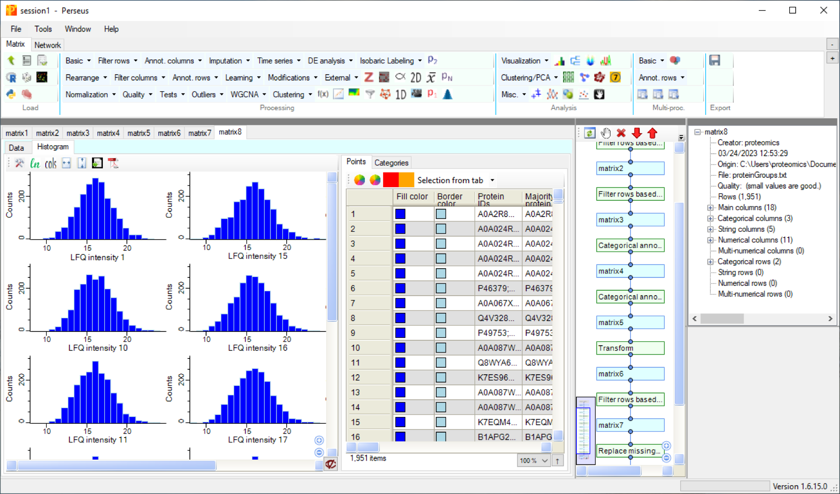

And with choosing the option Selection from imputation you can see, which data had been added to replace missing values.
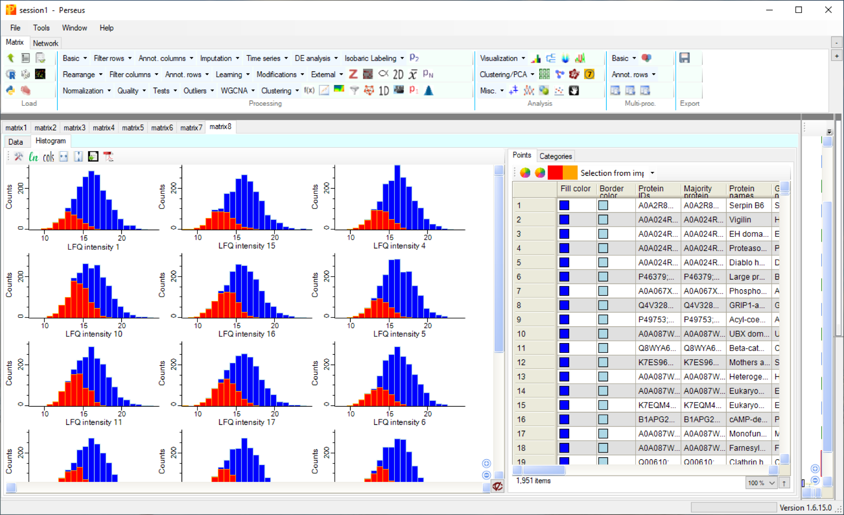

The next step in quality estimation is to inspect how reproducible the protein quantities were measured. For an overview one can look at the correlation between measurements - in particular technical and biological repeats. They should show a high correlation value.
Choose the command: Visualisation > Multi scatter plot and choose the new tab Multi Scatter Plot in the tabular area of the program interface. Select the parameter Pearson correlation.

Run 10 and 11 represent technical repeats - their correlation coefficient is 0.762.
Run 12 and 14 are from different experimental groups - their correlation coefficient is 0.444.


A more global analysis of which runs show similarities in the protein expression profiles can be achieved by doing a cluster analysis.
Choose the command: Clustering/PCA > Hierarchical clustering and choose the tab Heat Map.
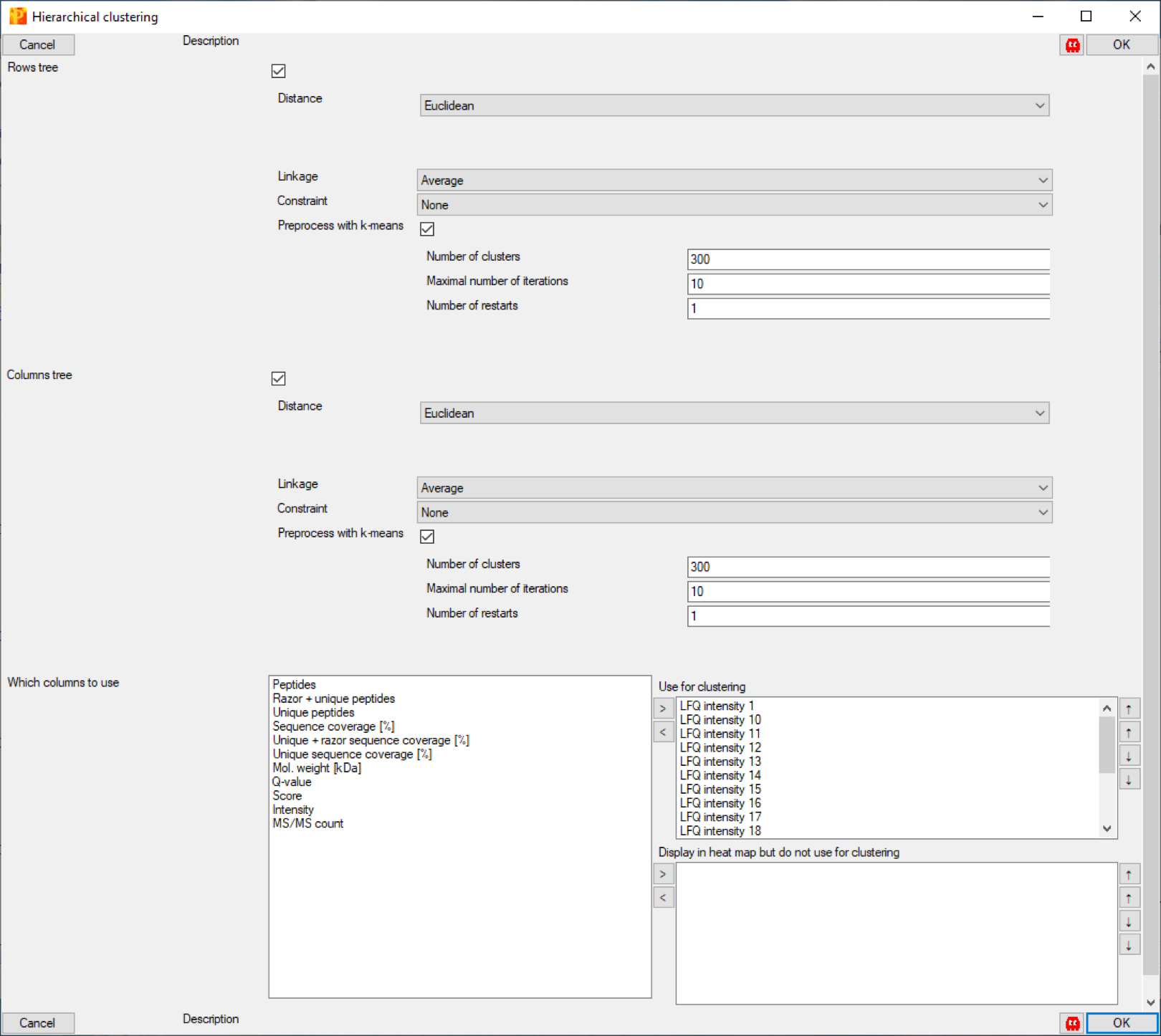

You can see how the different sample groups cluster together (1 - 6), (7 - 12) and (13 - 18).
This can be visualised in a different way by using a principal component analysis.
Choose the command: Clustering/PCA > Principal component analysis
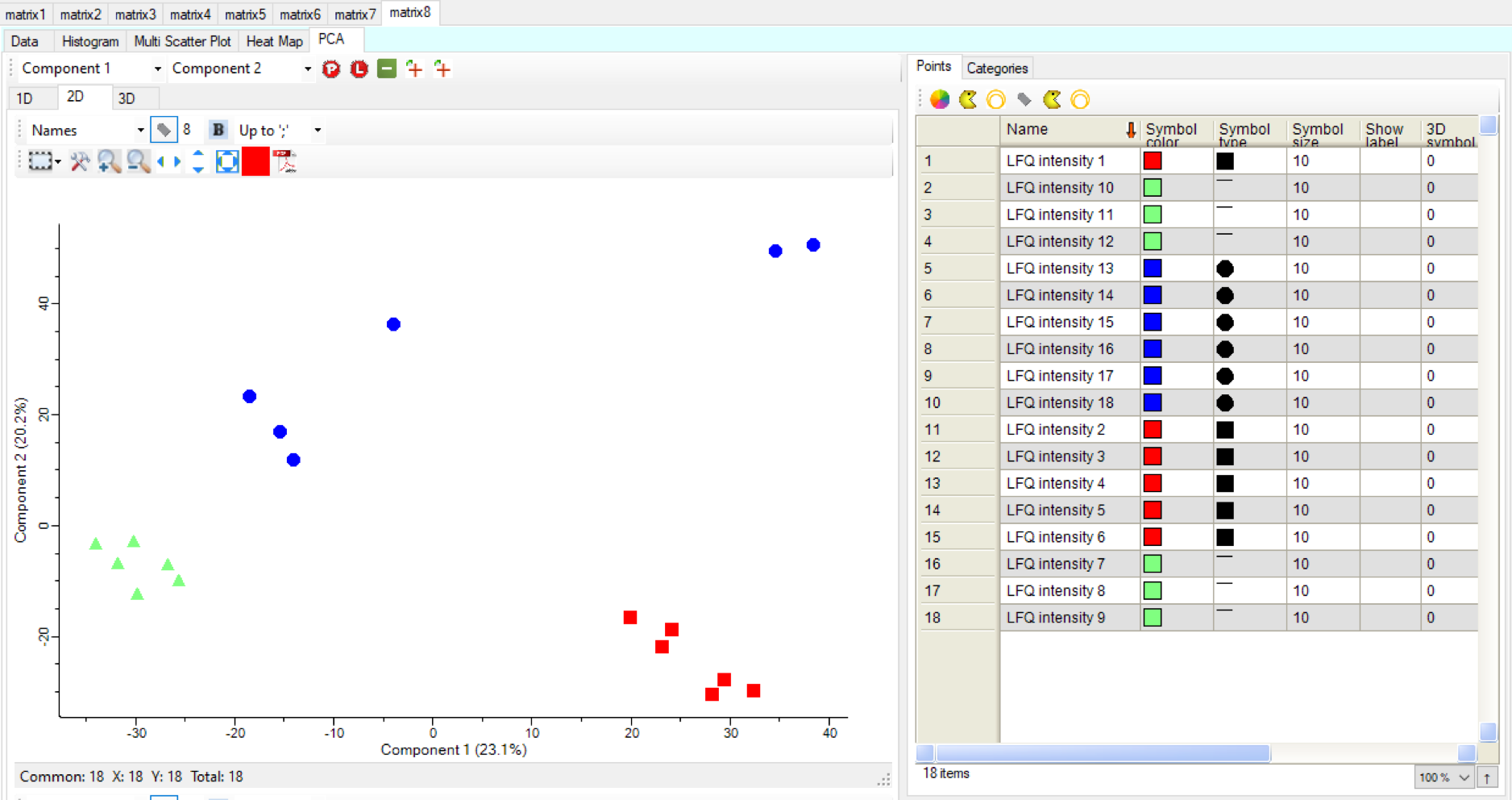
This analysis shows that the data from group 1 and 2 cluster well together whereas group 3 is more diverse. This can have experimental, biology based, or technical reasons.
Comments: matthias.wilm@ucd.ie