

The original tutorial of RNAlysis lists a lot of possibilities to visualise quantitative results.
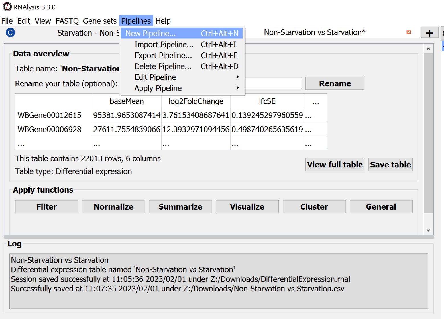
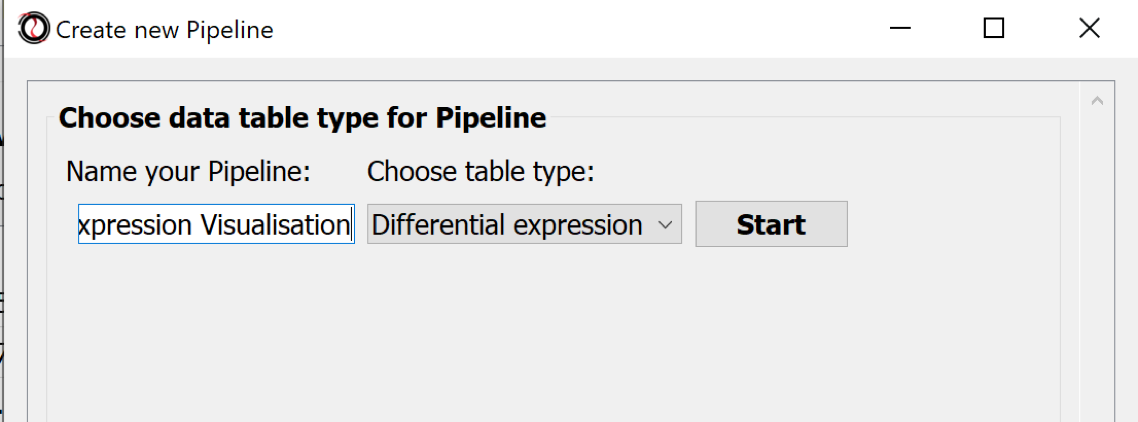
The processing steps of tabular data can be collected in Pipelines. Choose the menu Pipelines > New Pipeline.. to create one.
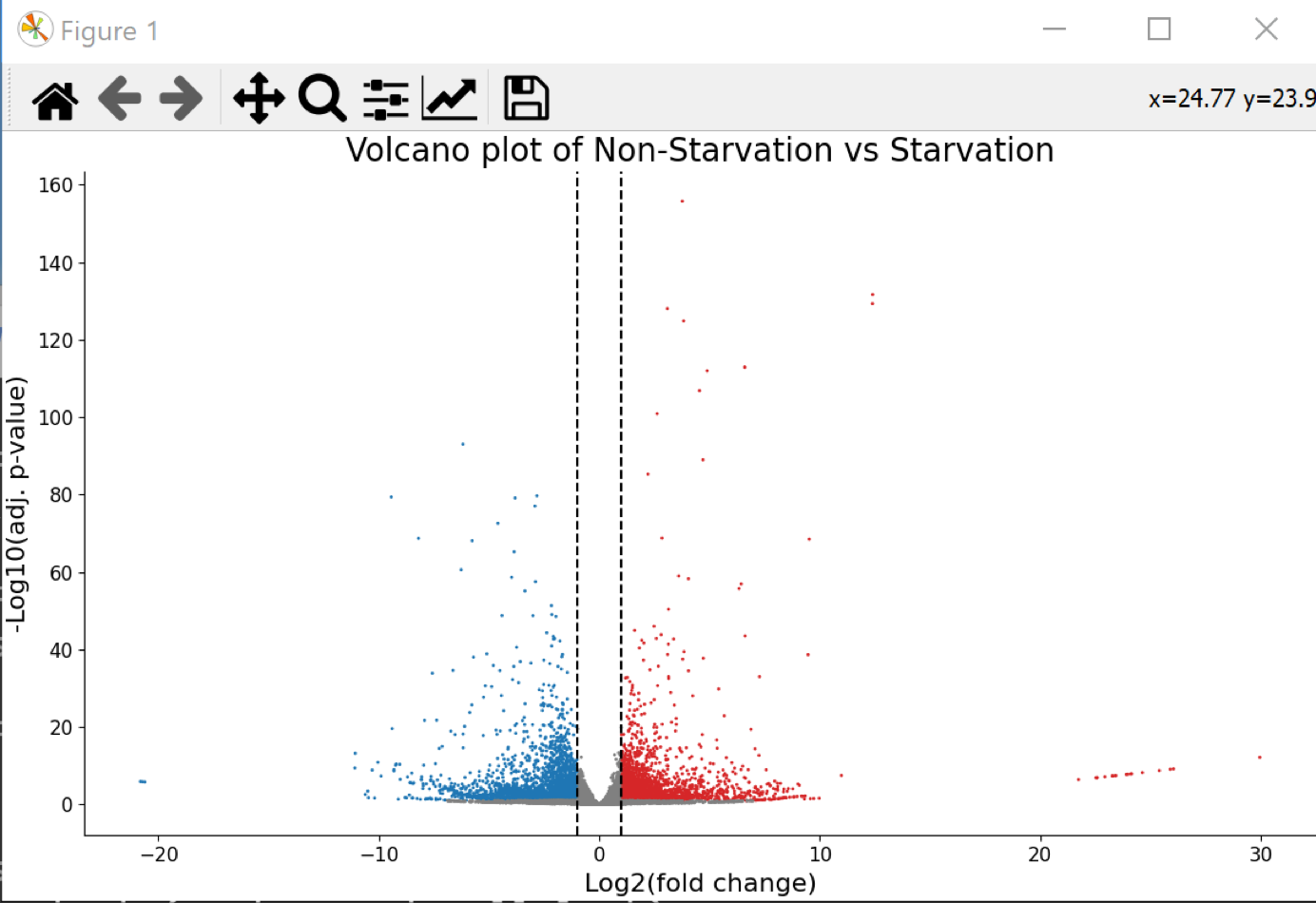
Choose the button-menu command Visualize > Choose a function... > Volcano Plot.
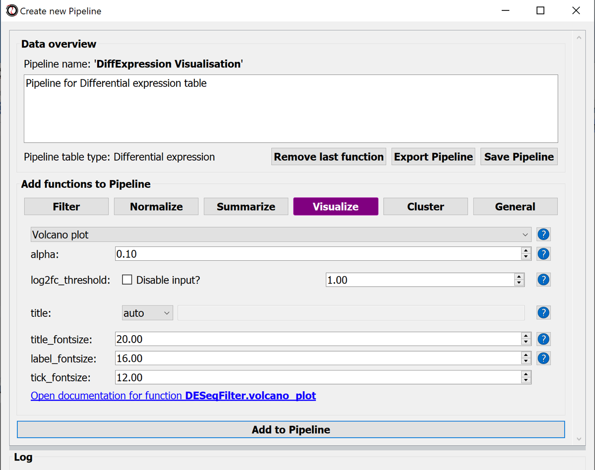
Hit the button Add to Pipline.
To display only relevant data we can add a filter and split the data into over- and under-expressed genes by adding additional functions to the pipeline.
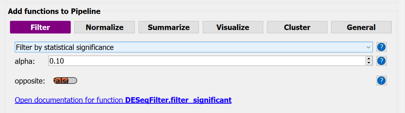
Choose the button-menu command Filter > Choose a function... > Filter by statistical significance + Add to Pipeline button
Choose the button-menu command Filter > Choose a function... > Split by log2 fold-change direction + Add to Pipeline button
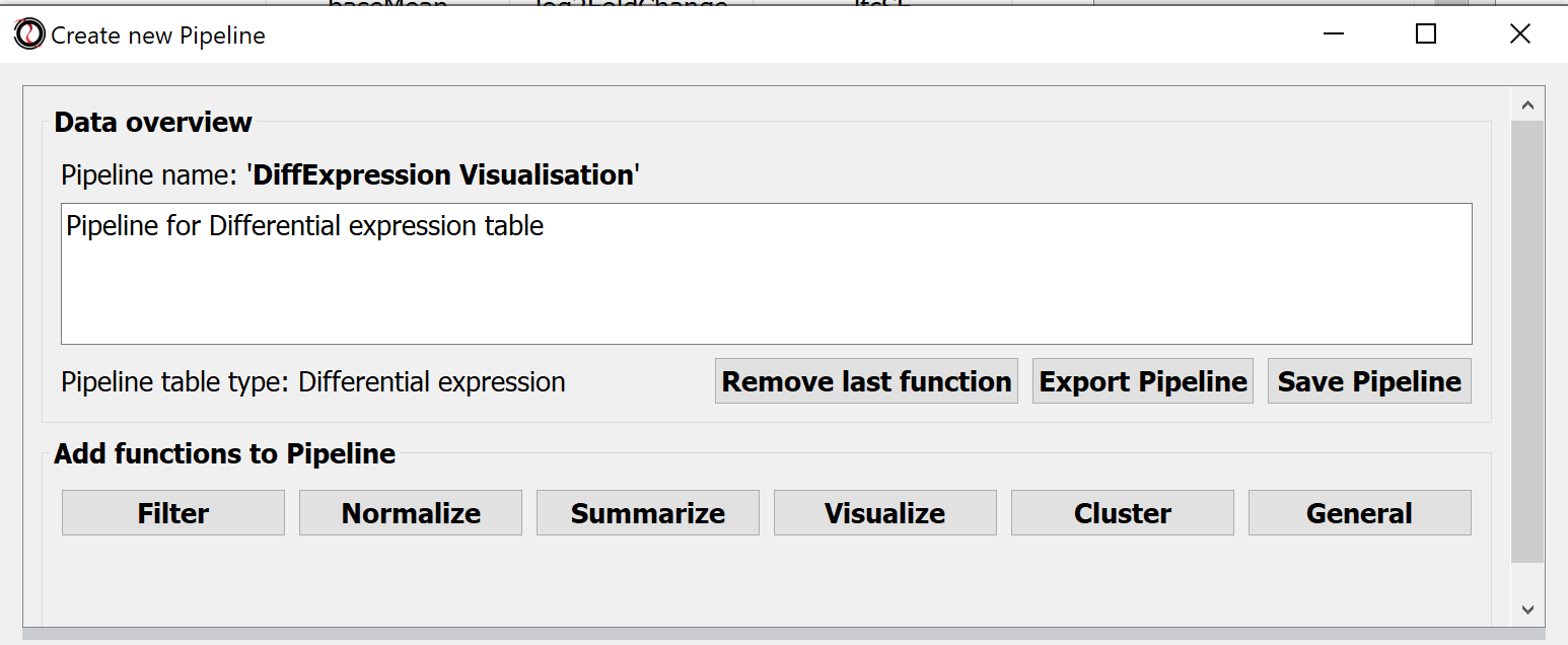
Hit the button Save Pipeline and close the Pipeline window.
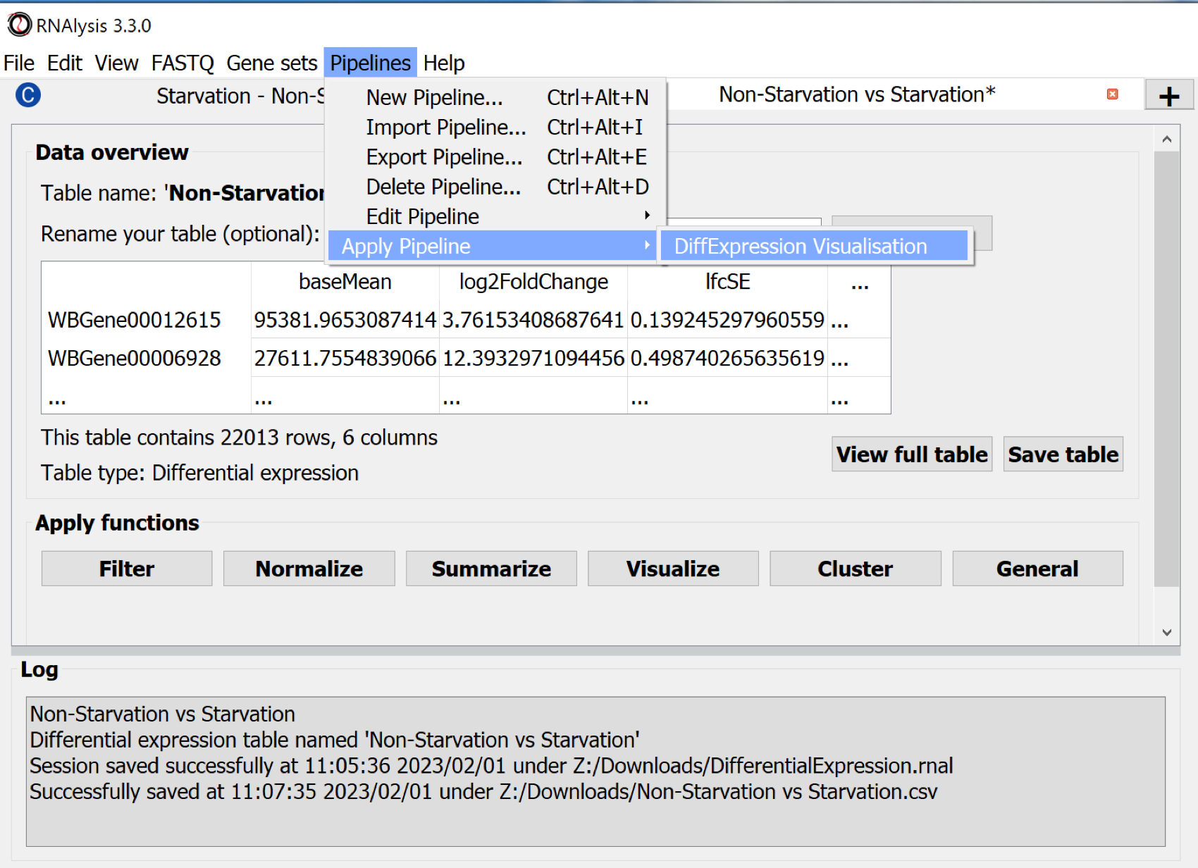
Use the command Pipelines > Apply Pipeline > "Name of the Pipeline" to apply the saved pipeline to a data table.
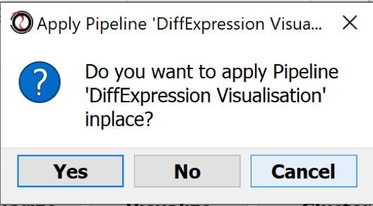
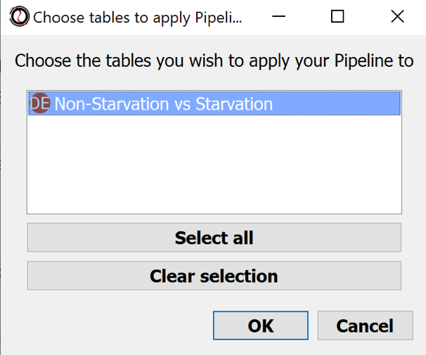
-> A series of windows will pop up:
- Apply the Pipeline in place ?: No
- Choose table: Non-Starvation vs Starvation
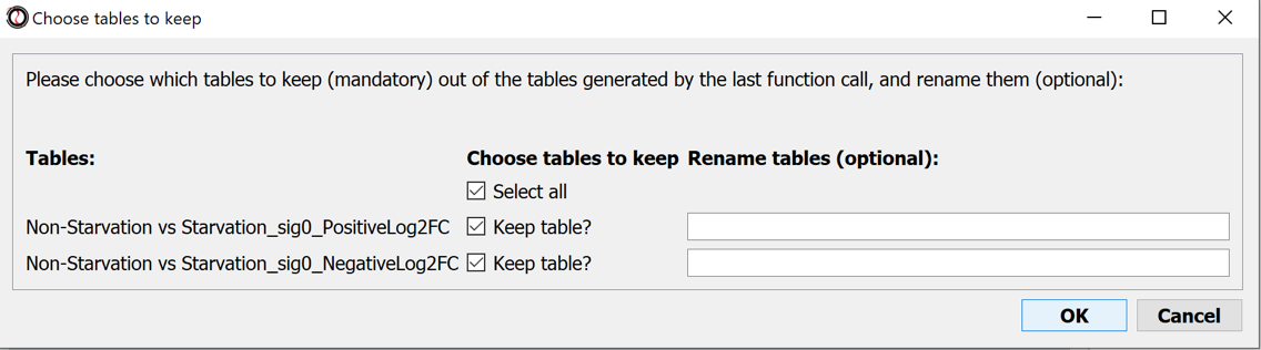
- Choose tables to keep: Select all
- Save the session
Results:
- A volcano plot was generated (behind the main window)
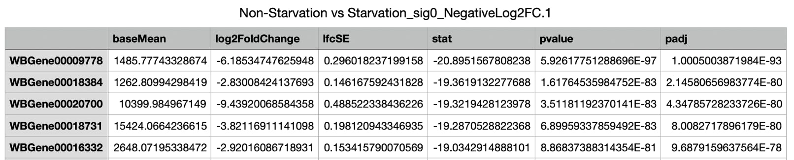
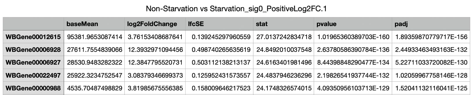
- Two more tables were generated - one with over- the other with under-expressed genes.
.